Using Color in your brand images
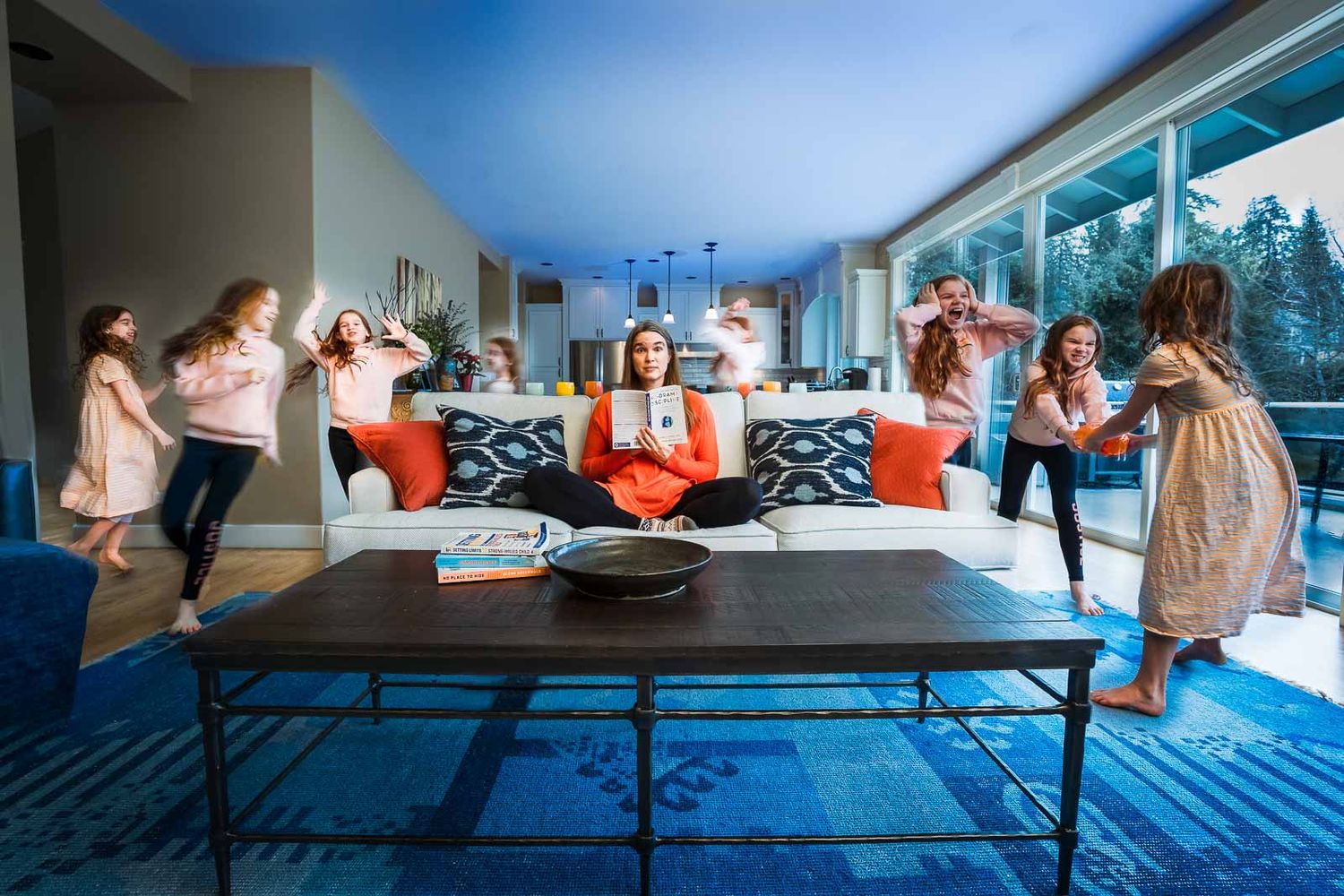
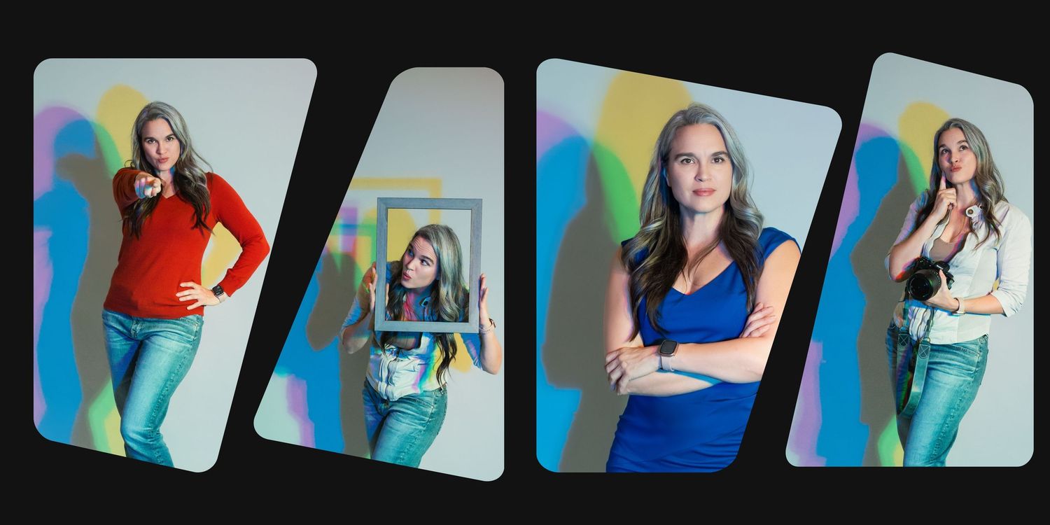
Color isn’t just decoration, folks —it’s a powerful branding tool. In a world where people form impressions in seconds and scroll past content at lightning speed, embracing bold, intentional color in your brand images and headshots can be the difference between blending in and standing out. Let me share a few reasons to embrace more color in your headshots or brand images and tips for how to get started.
Why color?
Two words, my friends: Instant impact. Research shows the average human attention span has dropped to just 8.25 seconds, and on mobile, users spend only 1.7 seconds viewing a piece of content before deciding whether to engage or scroll past. Yikes! That means your visuals need to grab attention immediately.
Did you know that social media users casually scroll through about 300 feet of content daily? — that's roughly the height of the Statue of Liberty! To break through that endless feed, your images must spark curiosity and emotion at first glance.
So if you've been sticking to white backgrounds and neutral palettes but are ready to branch out, read on for my 3 easy tips about how to effectively utilize color in your next headshot or personal brand session. Or reach out using the button below to talk to me directly about how color can be incorporated into your next headshot or brand session.


Tip #1: Use cOLOR for Eye-catching profile photos
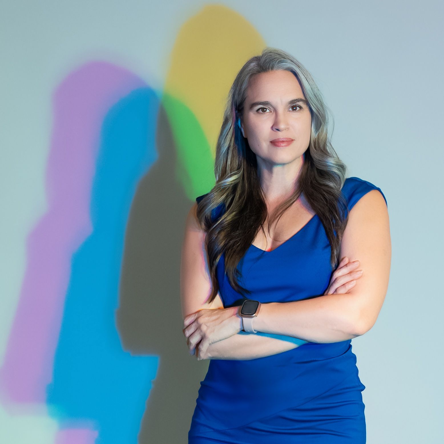
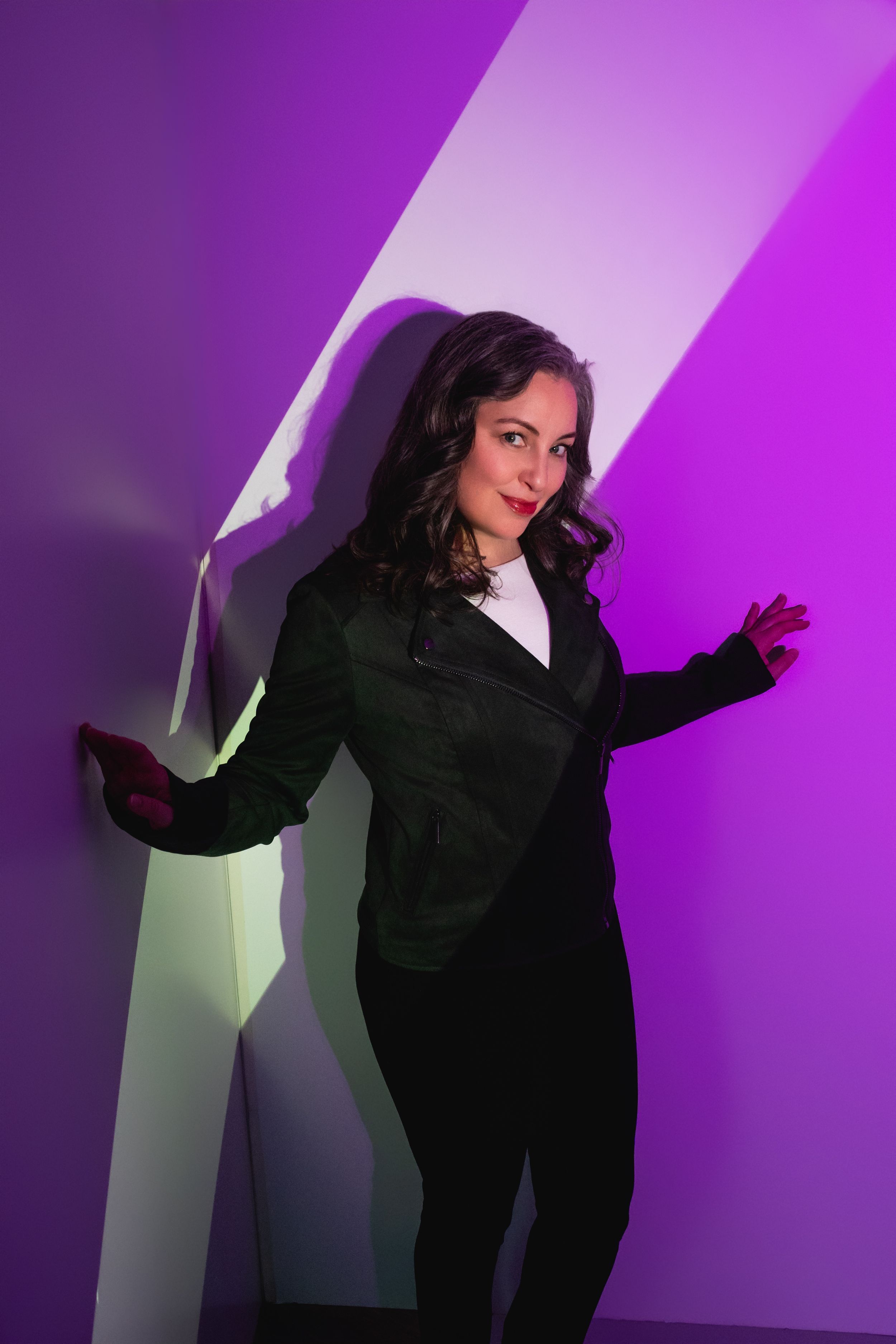
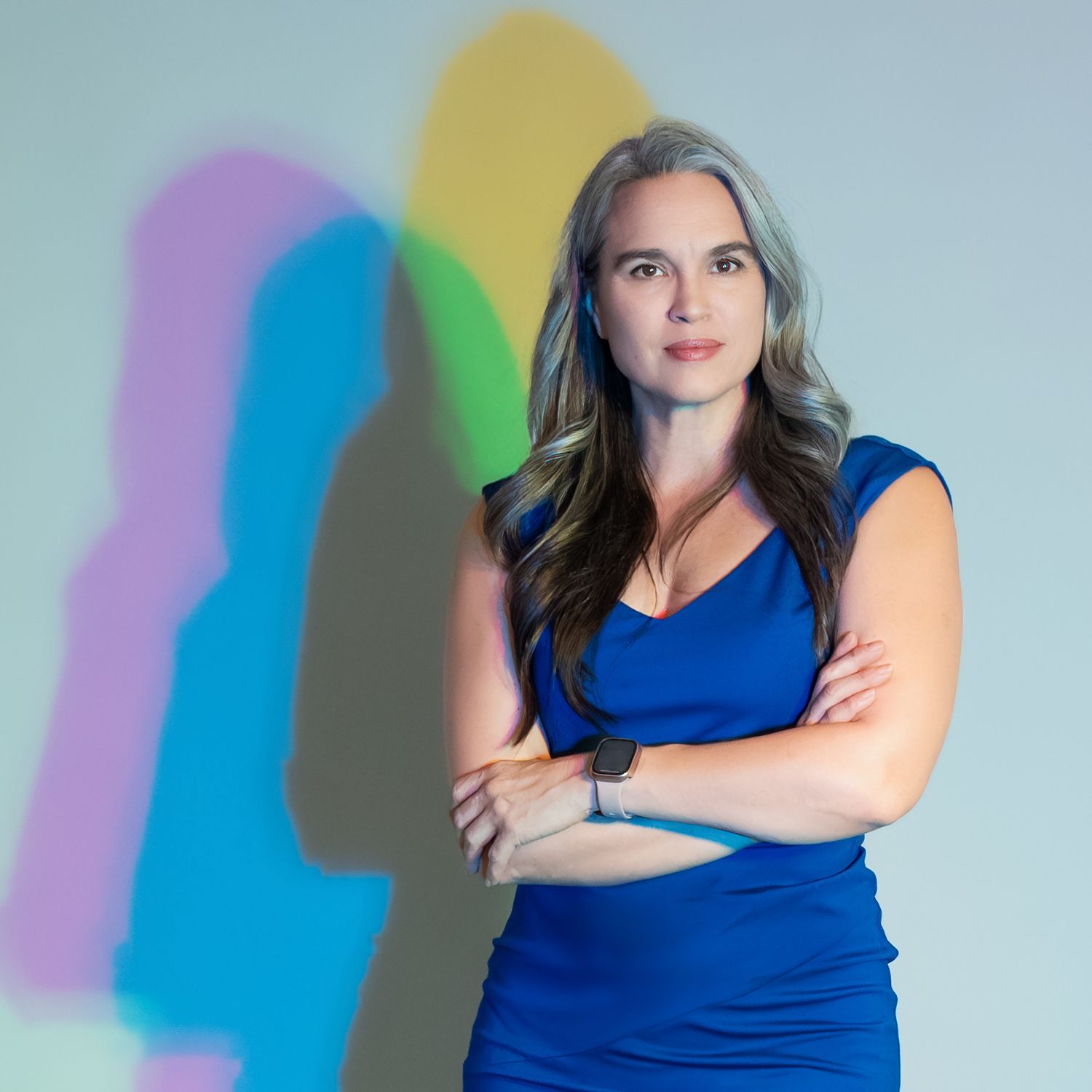
Color in headshots and profile pictures is like a secret handshake—it instantly tells people something about you before you’ve even said a word. A pop of bold color in your outfit or background can signal confidence and creativity, while softer tones might convey warmth and approachability. Think about how quickly people scroll through LinkedIn or Instagram; a splash of intentional color is what makes someone pause instead of passing you by. It’s not just about looking good—it’s about making sure your image reflects your personality and brand in a way that sticks in their memory long after they’ve moved on.
If big bold color isn't your jam, just start smaller by incorporating a thoughtful pop of color into your outfit.

Tip #2: Leverage Color Theory
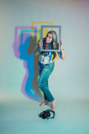
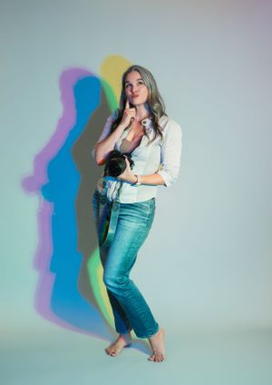
Color is such a game-changer in portrait and branding photos! It’s not just about looking good—it’s about setting the right vibe. Warm colors like reds and yellows bring out energy and confidence, while blues and greens feel more calm and professional. And when you mix colors that are opposite each other on the color wheel? That contrast makes everything pop! Picking the right colors can make your photos stand out, but also help tell your brand story in a way that connects with people. It’s all about choosing the right shades to match the message you want to send. I use a color wheel to help me think strategically about the vibe we want to set, from your favorite colors, your skin tone, clothing and backgrounds.
Pairing complementary colors (think blue and orange) adds instant visual pop, while analogous tones (like teal and navy) keep things harmonious. When you understand how colors play together, you can create images that not only look beautiful but also tell a clear story about you.
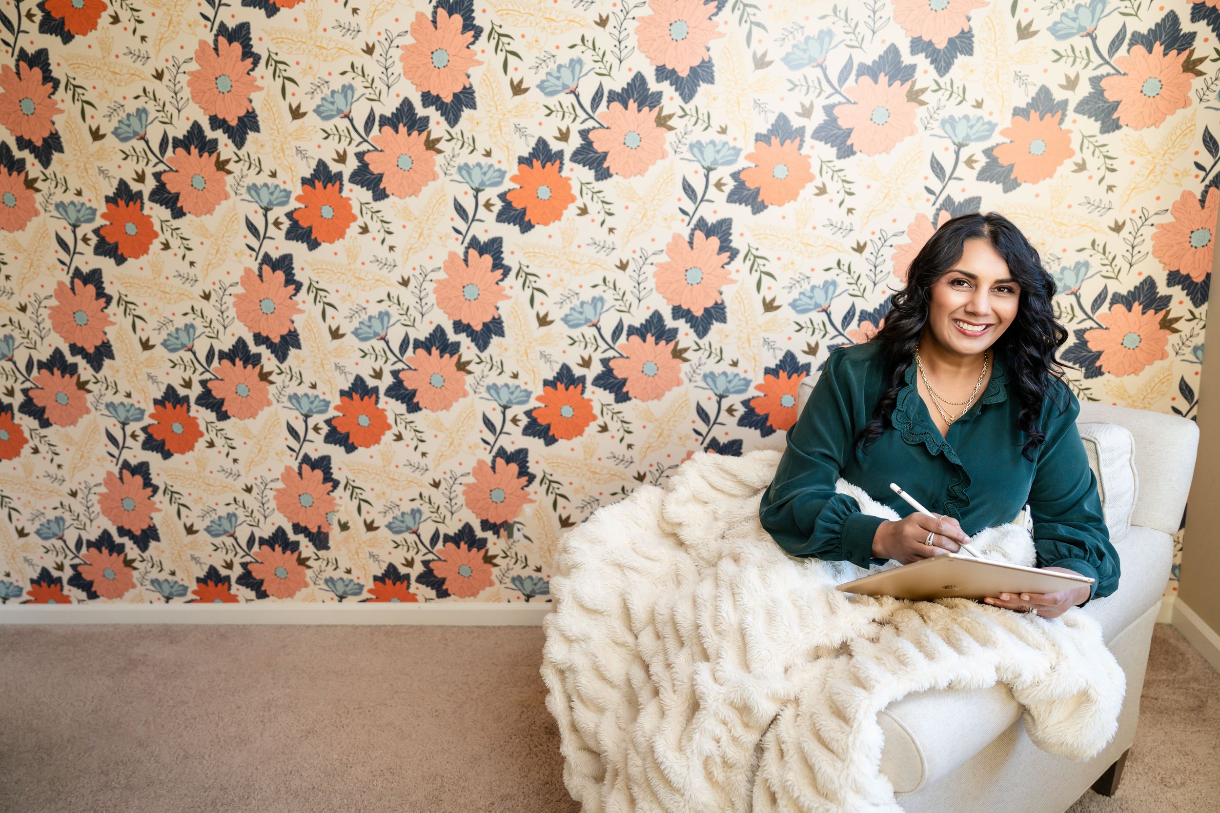
Starting small? Find a colored wall in one of your brand colors and then incorporate a complementary color through your clothes or accessories to really make some visual impact.
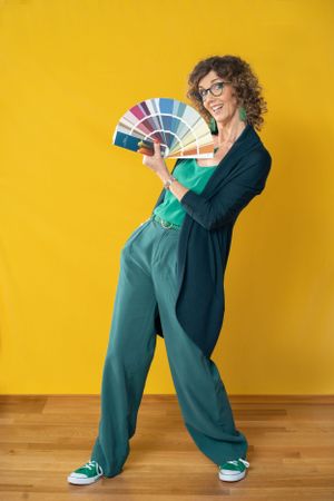
(Photo credit above to the fabulous Ling Ling Zheng Photography for capturing my complementary purple dress on a fun yellow backdrop. )
Tip #3: incorporate your brand colors
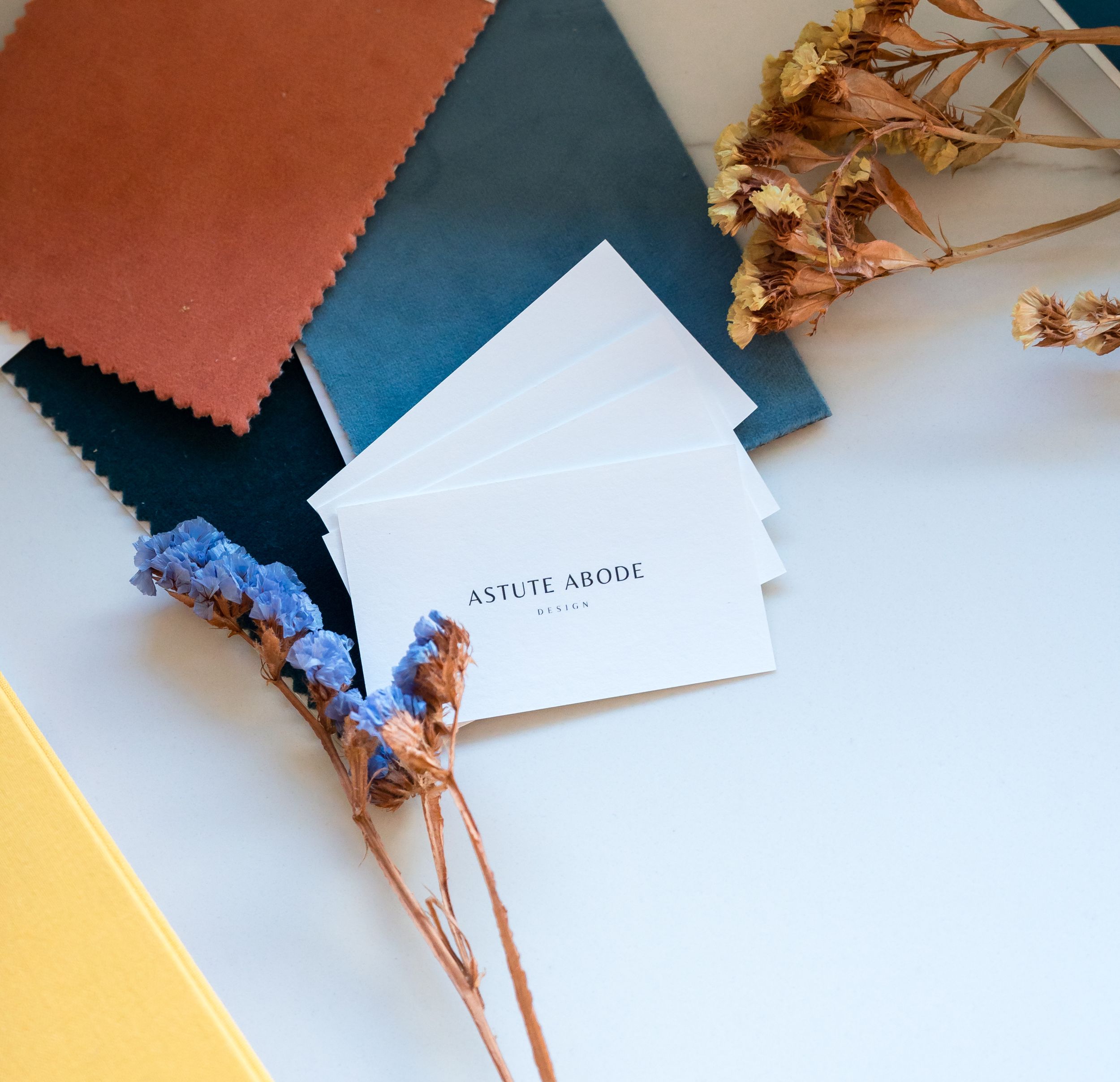
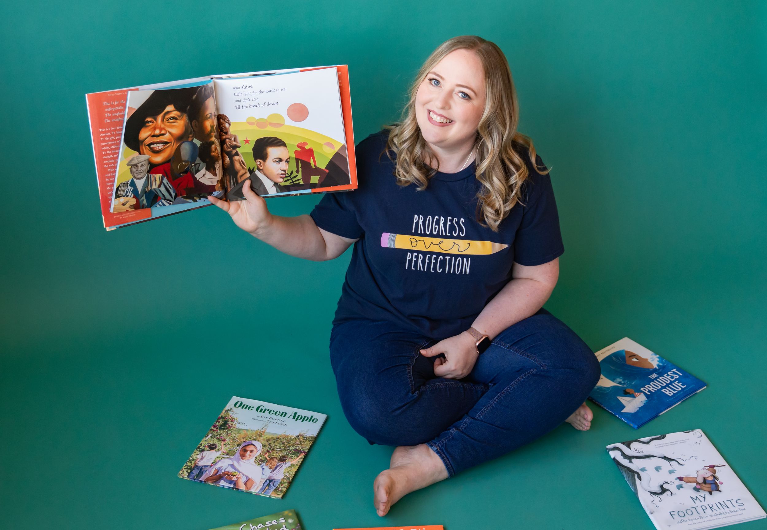
Using signature colors across your imagery builds recognition and consistency across your marketing channels. When your audience sees those hues, they immediately connect them to your brand story. This doesn't mean you have to only wear your brand colors in images. You can pepper in signature colors in less obvious ways as well - via colored pens, notebooks, items on your desk, or a scarf or hat.